> ## Documentation Index
> Fetch the complete documentation index at: https://makeswift-docs-branch.mintlify.site/llms.txt
> Use this file to discover all available pages before exploring further.
# Border
> Border is used to define the boundary around an element, providing visual separation and emphasis within a page.
You can customize a border's **thickness**, **color**, and **style** to enhance the overall design and highlight specific content. Border can be applied to all edges uniformly or to specific sides of an element.
## Thickness
Thickness refers to the width of the border around an element. Specifying border thickness helps create elements with varying visual emphasis, from subtle accents to bold outlines.
## Color
You can select from your [site colors](/product/theming#colors) to use as a border color. Customizing border color adds visual interest, creates contrast, and reinforces branding.
## Style
Choose from styles like dotted, dashed, or solid lines to suit different design preferences. Dotted lines create a pattern of small dots; dashed lines consist of short dashes separated by spaces; and solid lines provide a continuous, unbroken border.
## Examples
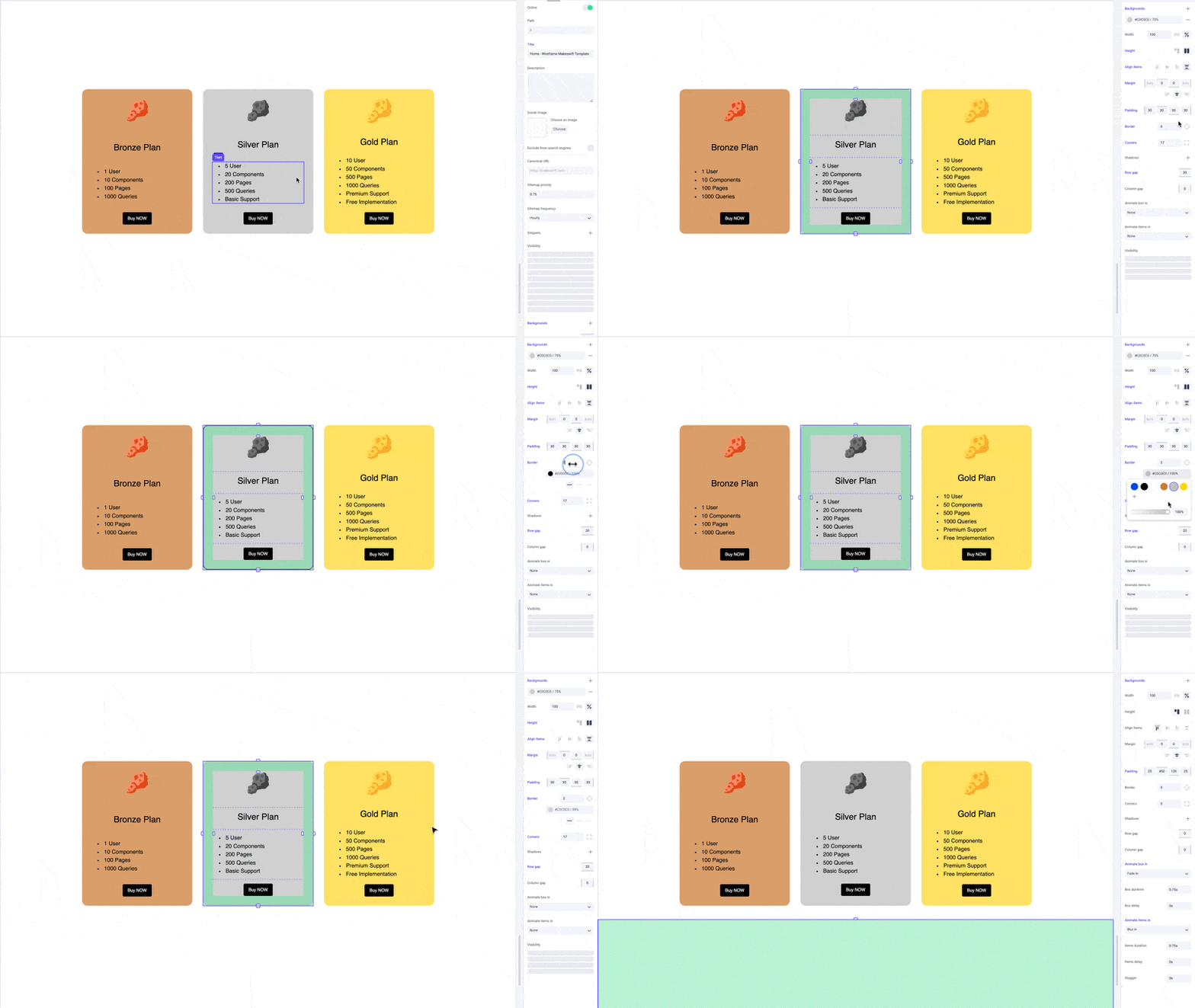
Apply borders to boxes to make them pop out as cards.
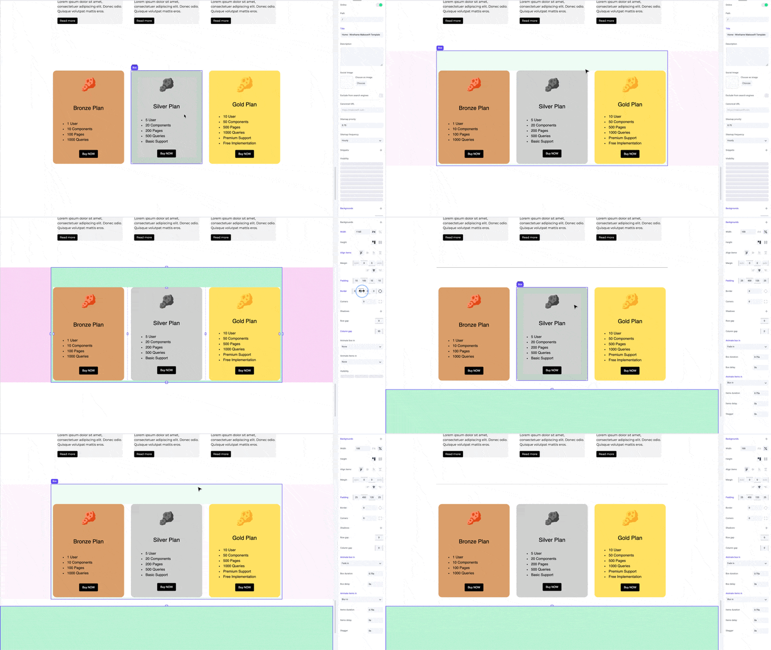
 You can apply borders to specific sides to create dividers between elements.
 ## Pro tips
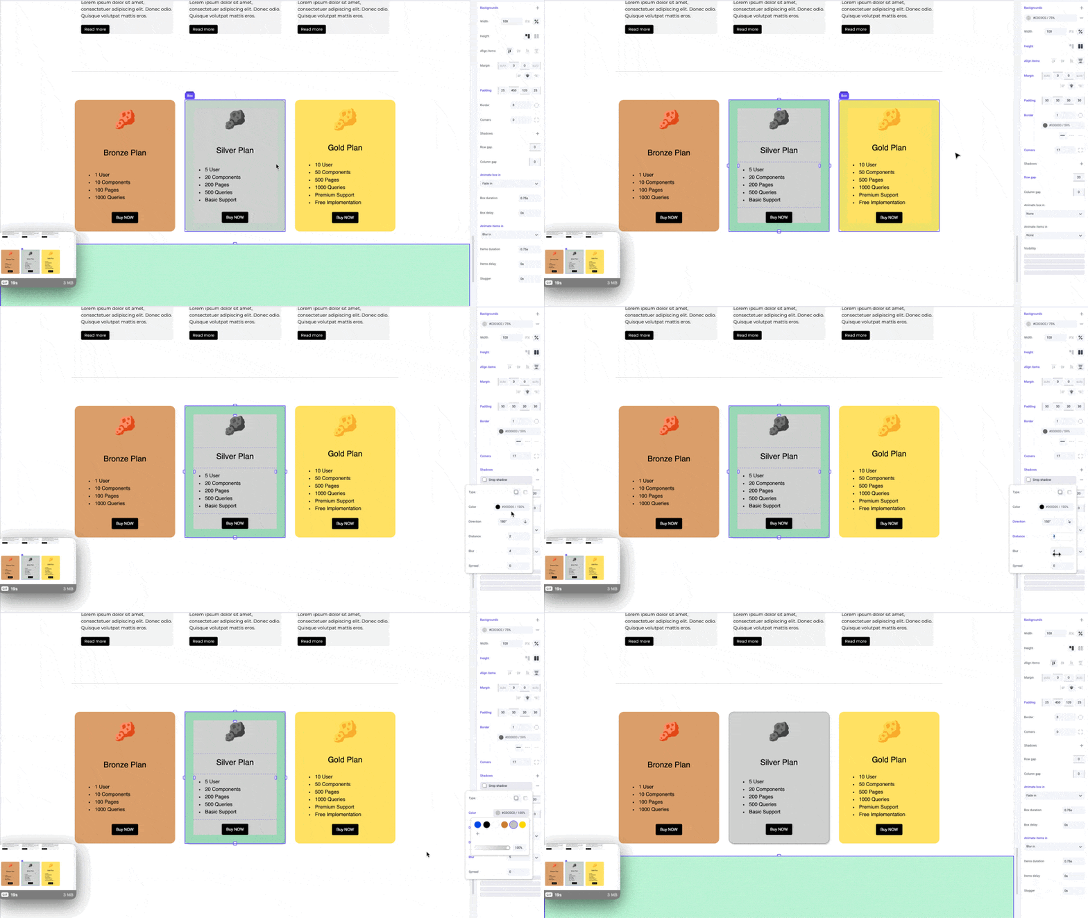
Borders complement shadows, giving your boxes a crisper edge and emphasizing the depth of the shadow. Lower the border color opacity to create a more subtle effect.
## Pro tips
Borders complement shadows, giving your boxes a crisper edge and emphasizing the depth of the shadow. Lower the border color opacity to create a more subtle effect.
 ## Shortcuts
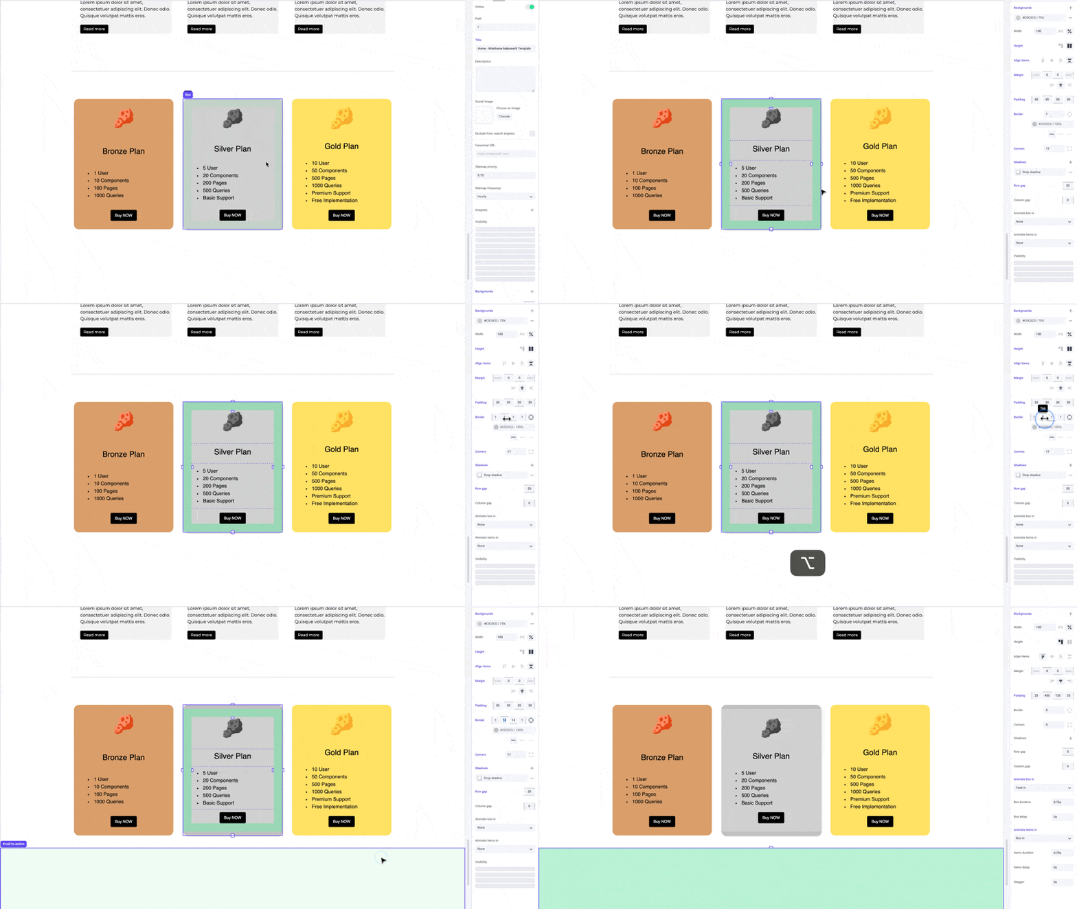
While dragging the border panel inputs, hold the `⌥ Option` or `Alt` key to equally change border width on both sides of an element. Hold `⇧ Shift + ⌥ Option` or `Alt` to equally change border width for all sides.
## Shortcuts
While dragging the border panel inputs, hold the `⌥ Option` or `Alt` key to equally change border width on both sides of an element. Hold `⇧ Shift + ⌥ Option` or `Alt` to equally change border width for all sides.
 ## Developer notes
You can give your team control over the border property for any custom component using the [Style](/developer/reference/controls/style) control.
## Developer notes
You can give your team control over the border property for any custom component using the [Style](/developer/reference/controls/style) control.