`. From a developer perspective, boxes can also be synonmous with [Slots](/developer/reference/controls/slot). Use Boxes to configure different [layouts](/product/layouts).
Double-click on any text component on your page to start editing it directly, similar to Google Docs. Text components use the "paragraph" block tag by default, but you can change it to a heading or list in the panels sidebar. Text components can also be styled with [text styles](/product/site/text-styles).
The block panel applies to an entire paragraph and correlates to the HTML tag used on the live page. Block options include:
* Paragraph
* Heading 1
* Heading 2
* Heading 3
* Heading 4
* Heading 5
* Heading 6
* Bulleted list
* Numbered list
* Blockquotes
Block tags affect a page's [SEO](/product/SEO), so make sure to use the appropriate options throughout your site.
The image component is placed directly as content on your page, unlike a background image that goes behind content. Think of an image as framed art on a wall, whereas the background image is the wallpaper behind it.
To place an image, select an image component on your page and click "Choose" or “Replace” in the panels sidebar. Select an existing image from the files manager, or upload a new one.
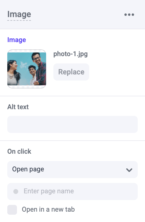 **Alt text** is used to provide descriptions of an image and increases the accessibility of your website for visually impaired visitors. Images can also be given links, similar to buttons.
Images will automatically be optimized and resized when published, increasing the performance of your site.
**Alt text** is used to provide descriptions of an image and increases the accessibility of your website for visually impaired visitors. Images can also be given links, similar to buttons.
Images will automatically be optimized and resized when published, increasing the performance of your site.
Use buttons to create links within your pages. The following are the link options for buttons:
* Open a Makeswift page
* Open an external URL
* Compose an email
* Call a phone number
* Scroll to a component
#### Open page
When linking to other pages within your site, you'll select from a list of existing pages. Once a page is selected, the page's URL will be used for the button link. If the page's URL is updated in the future, the button link will automatically update as well.
#### Scroll to element
To use “Scroll to element” you must first give the target component a custom name. This name will now appear in the dropdown found in the button's “On click” panel.
You can also select the screen position of the scrolled to component.
#### Styling buttons
You can select from a list of premade styles for your buttons. Along with styles, you can customize the size, shape, color and text styles.
## Global Components
Global components are components that you create and save visually within Makeswift and can be used across your entire site. They can be comprised of Built-in components, elements, and even other global components. They provide an easy way for you to create a reusable layout that you can easily drag an drop onto your canvas, without engaging with a developer.
### Creating a Global Component
You can create a global component by selecting an Element or group of Elements on your page and clicking the cube icon at the top of the [Properties Sidebar](/product/builder-basics). If you make an update to a Global Component, every instance of that component on your site will be updated as well.
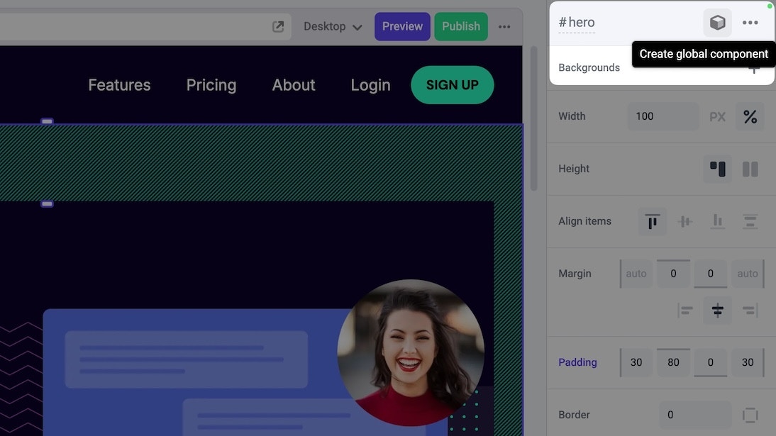 Name your global component and click **Yes, continue**.
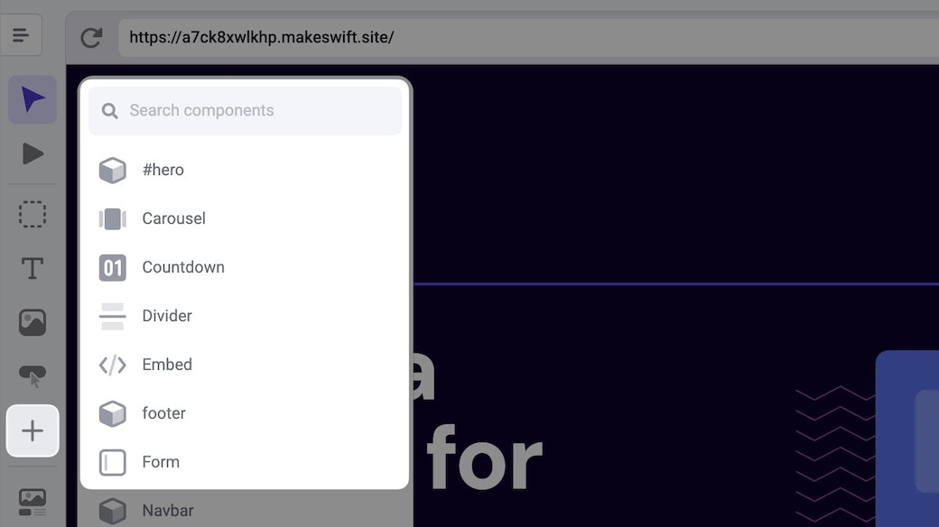
You can find your newly created Global Components in the Component Toolbar by clicking the plus icon. Then, you can click and drag to place it on the page.
Name your global component and click **Yes, continue**.
You can find your newly created Global Components in the Component Toolbar by clicking the plus icon. Then, you can click and drag to place it on the page.
 ### Editing a Global Component
Editing a Global Component will update all instances across your site. To edit a Global Component select any instance of that component in the [Canvas](/product/builder-basics) and click **Edit component** in the [Properties Sidebar](/product/builder-basics).
### Editing a Global Component
Editing a Global Component will update all instances across your site. To edit a Global Component select any instance of that component in the [Canvas](/product/builder-basics) and click **Edit component** in the [Properties Sidebar](/product/builder-basics).
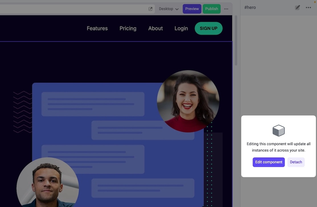 While editing a Global Component, you have full control over the content and styles for all components found in that component. You can add or remove components, and even place other Global Components inside.
When you are done with edits, click the **Save** button at the top right of the Global Component overlay.
While editing a Global Component, you have full control over the content and styles for all components found in that component. You can add or remove components, and even place other Global Components inside.
When you are done with edits, click the **Save** button at the top right of the Global Component overlay.
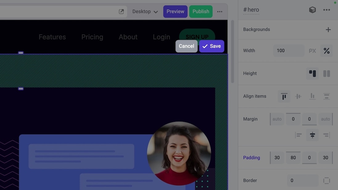
Global component updates are published as separate resources from pages. Learn
more about [publishing Global
Components](/product/publishing#publishing-site-resources).
### Detaching from a Global Component
Changes to a Global Component are propogated to all instances across your site. If you'd like to use a Global Component as a starting point and don't want to keep it in sync with the original component, you can detach an individual instance.
To detach, select the instance of the Global Component in the [Canvas](/product/builder-basics). Then, in the [Properties Sidebar](/product/builder-basics), click **Detach**. Remember, once detached, the instance will no longer be updated when the original Global Component is edited.
### Organizing Global Components
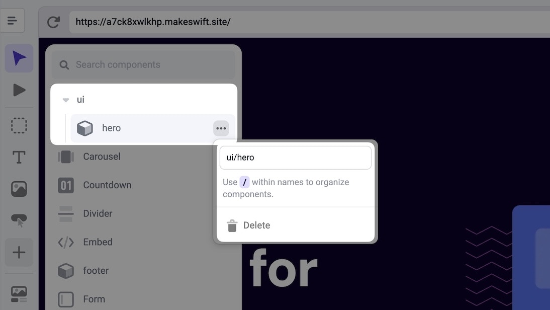
As your list of components grow, you may want to organize them. You can do this by including a `/` in the Global Component name. For example, a component with a name of `ui/hero` will be nested under `ui`.
 # Elements
Elements are instances of components on your canvas. While the difference can be subtle, what makes something an element is its unique placement and the specific customization data applied to it—essentially, an element is a component that’s been added and configured in a particular context.
# Elements
Elements are instances of components on your canvas. While the difference can be subtle, what makes something an element is its unique placement and the specific customization data applied to it—essentially, an element is a component that’s been added and configured in a particular context.
For example, the *component* defines what properties can be changed like the
title on a card. But the *element* holds the actual value you set for that
property. So if you update the title in one card on your page, that change
belongs to that card element, not to the card component as a whole.
There are two types of elements that you may encounter on a page:
Standard elements that are instances of components dragged onto the canvas.
Elements on the canvas that can be edited but cannot be moved or deleted
visually
## Elements
Elements are instances of components that you can place on a page. This is the more common interaction between your component toolbar and canvas and is the entity that hosts the actual values you set to your components properties. They are the starting point for all Global Components. Elements can be moved, copied, pasted, named, and deleted.
### Naming elements
You can name an Element by selecting it and changing the default name at the top of the [Properties Sidebar](/product/builder-basics). Element names must be alphanumeric and cannot contain any spaces.
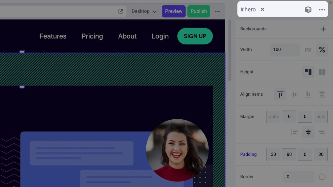 Element names are displayed in [Breadcrumbs](/product/layouts#selecting-components) and the [Elements Panel](/product/builder-basics#elements-panel) making it easier to discern between different elements.
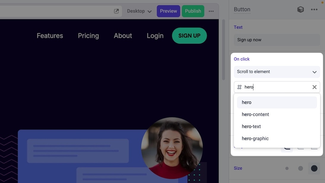
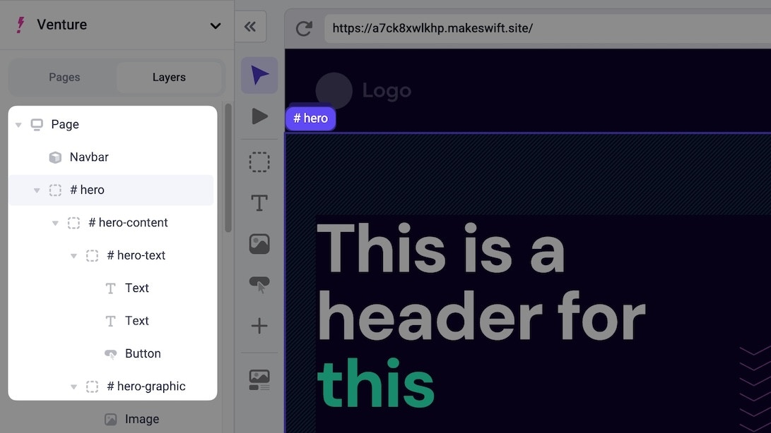 Custom element names also serve as the `id` property added to the element's HTML. This allows them to be scrolled to with buttons, images, and text links. All elements with custom names will appear in the **Scroll to element** dropdown found in the **on click** panel.
 ### Element actions
Actions for selected elements can be found at the top right of the [Properties Sidebar](/product/builder-basics) or by using keyboard shortcuts.
### Element actions
Actions for selected elements can be found at the top right of the [Properties Sidebar](/product/builder-basics) or by using keyboard shortcuts.
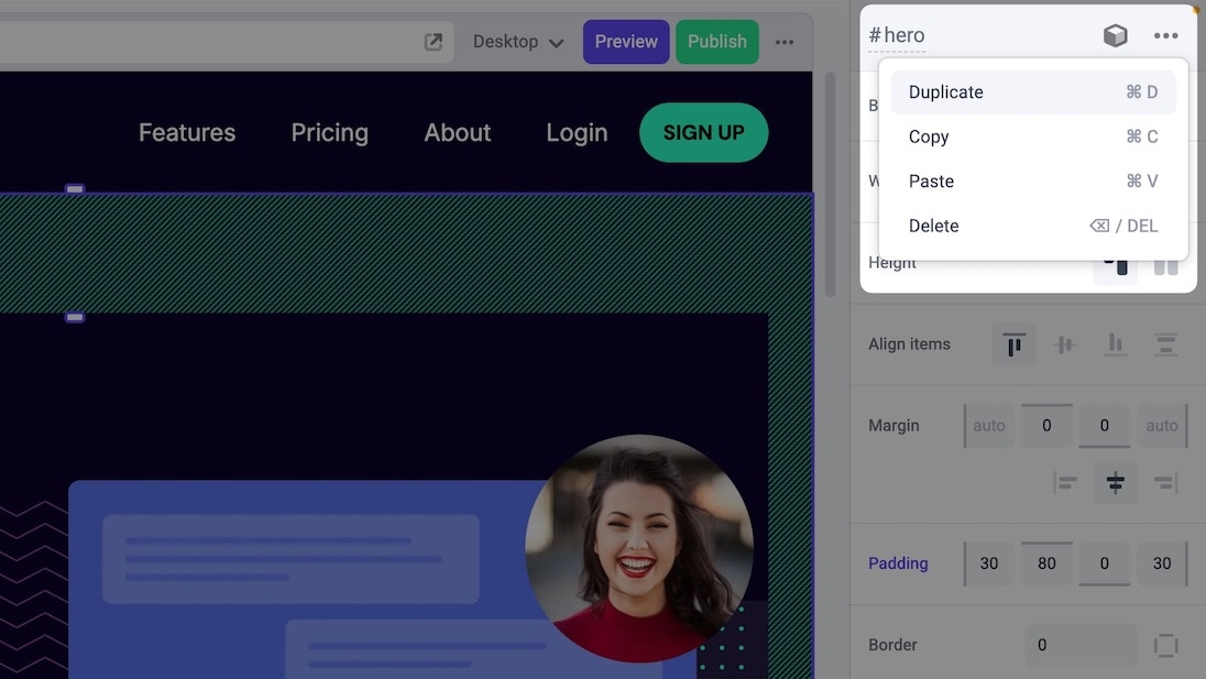 * Duplicate an element `⌘ + D` - creates an exact copy, including nested elements, either below or next to the original
* Copy an element `⌘ + C` - copies the selected element to your clipboard
* Paste an element `⌘ + V` - places the copied element in the [Canvas](/product/builder-basics) (you choose exactly where to place it)
* Delete an element `DELETE` - deletes the selected element
## Built-in Elements
* Duplicate an element `⌘ + D` - creates an exact copy, including nested elements, either below or next to the original
* Copy an element `⌘ + C` - copies the selected element to your clipboard
* Paste an element `⌘ + V` - places the copied element in the [Canvas](/product/builder-basics) (you choose exactly where to place it)
* Delete an element `DELETE` - deletes the selected element
## Built-in Elements
Placement and configuration of Built-in Elements are developer actions. For details see [``](/developer/reference/components/makeswift-component)
These are instances of elements that are placed on the page in code and cannot be moved or deleted visually. What makes these elements and not components is that you can still change the property values within Makeswift, however the behavior is slightly different depending on the configuration.
Some Built-in Elements may propogate changes throughout your whole site, while others may be utilized to lock down what is editable on a specific page or page type. They are affectively components that are purpose built to live on a specific page and allow specific editing capabilities.
### Examples
Here are some common examples of where a Built-in Element may be preferred.
#### Navigation Bar
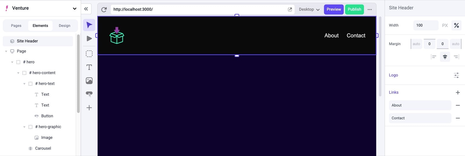
Implementing a Built-in Element for a Navigation bar allows for all new pages to automatically include a Navigation bar, without having to add it manually. Furthermore, any edits to the Navigation will propagate to all new and existing pages.
 #### Blogs
Utilizing a Built-in Element for Blog content allows for editors to focus just on the copy for a blog, while
#### Blogs
Utilizing a Built-in Element for Blog content allows for editors to focus just on the copy for a blog, while
**Alt text** is used to provide descriptions of an image and increases the accessibility of your website for visually impaired visitors. Images can also be given links, similar to buttons.
Images will automatically be optimized and resized when published, increasing the performance of your site.
Name your global component and click **Yes, continue**.
You can find your newly created Global Components in the Component Toolbar by clicking the plus icon. Then, you can click and drag to place it on the page.
### Editing a Global Component
Editing a Global Component will update all instances across your site. To edit a Global Component select any instance of that component in the [Canvas](/product/builder-basics) and click **Edit component** in the [Properties Sidebar](/product/builder-basics).
While editing a Global Component, you have full control over the content and styles for all components found in that component. You can add or remove components, and even place other Global Components inside.
When you are done with edits, click the **Save** button at the top right of the Global Component overlay.
### Organizing Global Components
As your list of components grow, you may want to organize them. You can do this by including a `/` in the Global Component name. For example, a component with a name of `ui/hero` will be nested under `ui`.
# Elements
Elements are instances of components on your canvas. While the difference can be subtle, what makes something an element is its unique placement and the specific customization data applied to it—essentially, an element is a component that’s been added and configured in a particular context.
Element names are displayed in [Breadcrumbs](/product/layouts#selecting-components) and the [Elements Panel](/product/builder-basics#elements-panel) making it easier to discern between different elements.
Custom element names also serve as the `id` property added to the element's HTML. This allows them to be scrolled to with buttons, images, and text links. All elements with custom names will appear in the **Scroll to element** dropdown found in the **on click** panel.
### Element actions
Actions for selected elements can be found at the top right of the [Properties Sidebar](/product/builder-basics) or by using keyboard shortcuts.
* Duplicate an element `⌘ + D` - creates an exact copy, including nested elements, either below or next to the original
* Copy an element `⌘ + C` - copies the selected element to your clipboard
* Paste an element `⌘ + V` - places the copied element in the [Canvas](/product/builder-basics) (you choose exactly where to place it)
* Delete an element `DELETE` - deletes the selected element
## Built-in Elements
#### Blogs
Utilizing a Built-in Element for Blog content allows for editors to focus just on the copy for a blog, while