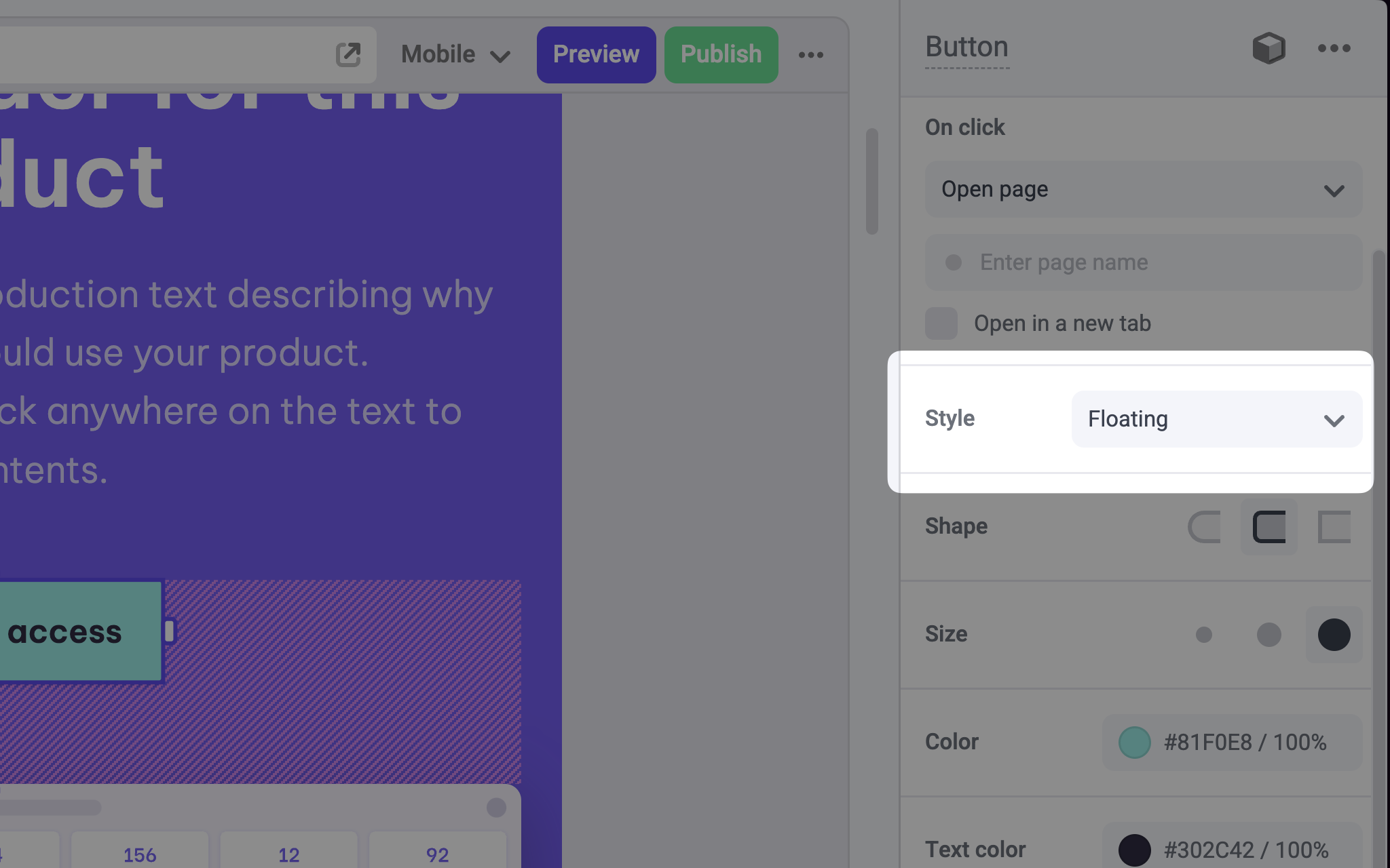
Params
Text for the panel label in the Makeswift builder.
The description shown in the Panel of the Makeswift builder. This can be written in Markdown format.
Added in
v0.24.8.Orientation of the dropdown label within the panel.
An array of objects of type The
SelectOption<T> that contains the options available in the panel input.label field is displayed in the Makeswift builder.The value passed to your component when nothing is set in the Makeswift
builder.
Prop type
The Select control passes the generic typeT from the selected Option to your component. If you don’t set a defaultValue and no value is set in the builder, your component will receive undefined.
Example
The following example adds a Select control to thevariant prop of a Button component.
.makeswift.ts is a naming convention for organizing Makeswift registration
code. Learn
more.